Photography

The Fat Shack, Baby, Fat Shack

Carnival food is great! Everything’s deep fried, dipped in chocolate and/or served on a stick. Unfortunately, what we eat at the Carnival stays at the Carnival. Now, you might be thinking to yourself: “what if I wanted MORE of that deliciously unhealthy food when the Carnival isn’t in town?” Well, there just so happens to be one restaurant that laughs in the face of healthy, regular food. This restaurant is called “The Fat Shack”.

While it may not be dipped in chocolate, (though, no one would be surprised if they ever went there) they have put just about every deep fried-finger food you can think of onto a twelve-inch hoagie.
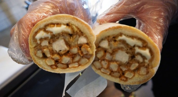
See for yourself:

aboutpage2

The Fat Shack originally started in a bagel shop, but later opened its first restaurant in Fort Collins, Colorado. Tom Armenti, the creator of the franchise, wanted to make a store where people can to get something to eat late at night. They now have stores open throughout Colorado, New Jersey, and Texas. You can read their full story in their own words on their website, which you can access here.

Last note, they also have a special challenge rightfully dubbed: “The Fat Shack Challenge.” In this challenge, one must three fat shack sandwiches, each packed to one and a half pounds, and it must all be consumed within 30 minutes. If one were able to complete this challenge, they would go up on the Wall of Fame, get a free T shirt, and the sandwiches are on the house. So, if you’re one of those people that really, really like anything deep fried, and you have a literal black hole for a stomach, then this is the challenge for you. When you can’t your fix of Carnival food, The Fat Shack’s the next best thing, hands down!

REP US ARMY

While on Reddit, I saw this promoted post in the feed. I feel like it’s simple, yet effective. The message is that being a part of the US Military will prepare you for success in life. Let’s look at how the design of the visuals effectively portray this.


Repetition


Through out the video, it cuts to various clips of the same smiling woman in the center of the shot, wearing different uniforms and holding new postions. The text is also consistant, staying in the lower-left corner.


Contrast


Each shot alternates between dark and light, which grabs the viewer’s attention by making a very stark contrast between each shot.


Color


Yellow is a powerful, commanding color. It doesn’t just draw attention, it demands it. Because it’s so bright and powerful, however, it can be overwhelming to the eye in large quantities. That’s why it’s paired with black text and a black logo, to diffuse the brightness of the yellow.

This was a simple ad that catches the viewer’s attention as they scroll through. Each shot is designed to hold the viewer’s attention as they give their brief message, and it holds on to the viewer’s attention with a firm grip.

REP Detective Pikachu

This is the movie no one knew they wanted. Detective Pikachu is coming to theaters soon, and Pikachu himself is being played by none other than Ryan Reynolds. The idea of Pokemon in a live-action movie might sound terrible, but what caught me and everyone else off guard was how well designed the live-action versions of the Pokemon were. I wanted to show this still to show how good this movie looks, design wise.

Rule of Thirds

In this shot, Pikachu is placed off center to the right. This lets you see more of the background, and makes you feel like there’s more space on the screen than there actually is.

Contrast

The background is a cool blue, which contrasts with the warm yellow of Pikachu’s fur. The fact that there’s color at all in the background shows they put thought into this frame.

Composition

I think they did an amazing job reimagining the Pokemon in this movie. They kept their cartoony silhouette, while giving it enough detail to make it feel more believable.


I think there was a lot of time that went into the design and film and animation that went into this movie, and I’m equally surprised and impressed with it.

REP Week 7

I was browsing Reddit when I came across this one. This is an ad for the new CBS series, Tell Me A Story; a show that intertwines fairy tales with the darker parts of real-world New York. Let’s analyze why I think this is an effective design.


Repitition

the portraits create repitition with each consecutive photo within each other, drawing you towards the center of each portrait and seeing each person in each portrait.


Contrast


The black blur that frames the ad draws the eyes toward the center. It also helps some of the text pop quite nicely.

Typography

this ad uses two types of fonts, one that is used for the title, which really stands out, and the other used for the rest of the type. The title even uses a different color to make it stand out even more.


I think that the design of this ad catches the dark nature of the show. It’s dark and hazy, has a unique font type for the title, and the design draws your eye through the ad quite nicely.

Illustrator Highlights

Here, I have a little collection of things I’ve made in Adobe Illustrator. It’s small, But I love this program, and often use it in my free time. So I will probably continue to add more as time goes on.


Above are some things I’ve made in my spare time. I like to make my own icons and logos for personal use. Plus, the extra practice is good for my personal growth. At the time of this post, it’s October and I’ve been making a lot of Halloween themed icons. The moon is what I am currently using on Discord.


These are some icons I’ve made in the past year. I made them for classes, but I wanted to make something I would like, and not just something to get me a grade.


Lastly, this was my attempt at making a photo-realistic watch in Illustrator. Aside from a few small details, I think it turned out great!

REP: McDonald’s

Image result for brand mcdonalds

McDonald’s is one of the most iconic brands in the world. As such, their logo and slogan are known everywhere, especially in the west. The design here is quite effective too, so let’s take a look at how they accomplished this design.


Alignment

The design is center aligned, which I think most people find to be the most satisfying way for something to be aligned. Everything looks uniform, and balanced.


Contrast/Color

The colors have a very warm feel to them, and contrast nicely to clearly define the shapes of the logo and slogan.


Proximity

By placing the slogan by the logo, they associate “I’m lovin’ it” with McDonald’s.


McDonald’s logo is well designed, and effective. It’s very recognizable, warm, and has a good slogan that’s easy to remember.

Reverse Engineer Post: Happy B-Day, Sonic!

Here, we have a tweet from Discord, an online service for chatting and creating groups, saying happy birthday to the iconic blue hedgehog on his birthday. Since Discord’s main audience are gamers, most of their audience know who Sonic the Hedgehog is. People may not love his games, but the internet have come to love this character over the years. By saying happy birthday to our little blue friend, they acknowledge how he means to gamers and the internet. You can tell that a lot of people appreciated the post because of the high number of likes, comments, and retweets it has.


#NationalPancakeDay

Today marks a day for celebrating one of the most iconic breakfast dishes, the pancake. It comes in many different forms depending on where you are in the world, but the rich doughy flavor is always the same. To promote National Pancake Day, #NationalPancakeDay has been spread throughout various social media. For this post, I will be looking specifically at Twitter.


Pancakes on their own aren’t particularly valuable. In fact, it’s a pretty simple dish. But with its simple yet savory flavor, and all the different ways it can be eaten have made this breakfast item popular all over the country, enough so to get a national holiday. In other words, Its perceived value is far greater than its actual value.

Another thing to note is how easy it is to contribute to a celebration of pancakes. The post above is just a GIF of one of the Super Troopers chugging some maple syrup. Anyone can do that. It even gives professional pancake makers the opportunity to show off what they can do with pancakes, but you could just take a picture of some pancakes that you ordered at a restaurant and post it. It wouldn’t be as cool as pancake art, but it wouldn’t be any less valuable.


One thing I wasn’t expecting, but it was there, was the story principle. Down below is a recipe for pancakes written by Rosa Parks. It’s small, but it says something. It shows pancakes as a part of history in a small way, and that they are ingrained in American society.


If you want to see more of these posts yourself, you can click the link right here.

My Photo Book

When making my photo book, I struggled with Blurb. It gave me some trouble with the editors and, eventually I decided to design the book from scratch. This was a pretty difficult task, since I had create my design from scratch. I even had some trouble exporting my file to Blurb itself, and I think it may be because I have an older version of Adobe.

I’d like to think of this as a learning experience. I wouldn’t this say this is my finest work, but if I needed to make a photo album again, I at least know how to do it. Then, hopefully, I would be able to show how much progress I’ve made. Everyone has to start somewhere, and in a lot of ways, this is a starting point for me, in terms of photography, and book design. While it may not be a glorious masterpiece, I can say that I put effort into it, and I learned from it.

Cover

Mitchell-Mantor-Photo spread-content


Submitting to a Contest

I chose to submit my photos to contests on Viewbug. I really chose this one because the other sites charged money to submit into, and I don’t have any more money. It was quite easy to submit on Viewbug and there were quite a few good photos in each contest. All I had to do was pick what I wanted to submit and hit upload. As far as I could tell, the only guidelines for the submissions were that they had to be on topic.

I think my photos may be lost in a sea of contenders, but I don’t think my photos are worse than the others by any standard. In fact, I felt like my photos fit in quite nicely. Below i have some links to my submissions. My posts were submitted 3/24/2018.

To view this submission, click here.


To view this submission, click here.


My Top 5

These images aren’t ranked in any particular order because I love them all.

I had a roommate at the time who had a dog, and while I had the camera, I wanted to see what kind of pictures I could get with him, this is my favorite.

I just love the light and dark going on in this photo. I had a lot of great photos from Bannack, and this is by far one of my favorites.


Yet another image from Bannack that I loved. The lighting, the position, the sharpness, I felt like everything lined up perfectly for this one.


I tried my hand at adding textures to a photo to give it more character. I took a photo of a tree I found at the park and used a texture to make the photo look older.


Last, but not least, this find. It was so odd to find a laundry pod just sitting on the sidewalk. I love the sharpness around the subject, including the snowflakes, and the bokeh effect in the background and even some in the foreground. This image turned out better than I thought I was capable of.

Macros

Close-ups

I have some harmonicas. I was going to bring them to Bannack, but I left them at home (along with my lunch) by mistake. Since I missed that opportunity, I wanted to use one of them as a prop for one of these photos.

This buckle belongs to a spur I just so happen to have. It’s the same story with these as it is for the harmonicas, and I wanted to place them with a different back drop.

Water Droplets

For this one, bought some strawberries and oranges. My roommate had a platter he let me borrow, so the water droplets showed up a little better than they would on the table.

For this last one, I really wanted to try my hand at getting a water droplet to hang from the fruit. I still had lots of strawberries, so I wanted to see if I could get it to hang from one of their leaves. This was the result.

Bannack Portraits

This one’s my Group photo (obviously), and we didn’t do anything too fancy with this one. However, I feel it still turned out well, and it didn’t need as much editing as some of the other photos I have taken.


This is one of my favorite photos I had taken while at Bannack. Jake had some really good poses, and we didn’t need to give him much direction.

This one was pretty fun, it had this Claustrophobic feel of being inside a mine shaft.


This is my other favorite photo. It was taken with a flash, because it would have been too dark in this building otherwise. I love how the light adds definition to our model’s silhouette and draws the eye towards him.

The models all had great outfits at Bannack, but I think this one impressed me the most. Everything from the spurs to the sweet mustache,  This just screams “Wild West.”

Bannack Fine Art

This was one of the earliest photos I took. I think it captures the stillness of the town and how I would like to remember it.

This one needed a lot  of editing, but I managed to make something pretty neat out of it.

I liked the flames in this one. In the original photo, they were red. After playing around with some ideas, I felt an orange was a cozier color.

We loved this piano and wanted to get photos with it. I like this one because it feels like there’s a story to tell here.

This last one has a sort of “home in the woods” kind of feel. Despite how secluded it may feel out there by today’s standard, this used to be a big neighborhood that people called home. I wanted to capture some of that.

Bannack Series

For some reason, I fell in love with the wagon wheels throughout Bannack. The age and the where and tear gave a sense of a time come and gone, and these were the peaceful remains. While they had mostly fallen apart, they remained iconic, even in this modern age, we can look at these and see how far we’ve come since then.